Superhero comics are full of artists who can draw an adult in a costume punching another adult in a costume. Far fewer can draw a ten-year-old who reads as ten, moves as ten and has a face that is a child's face rather than a shrunken adult's.
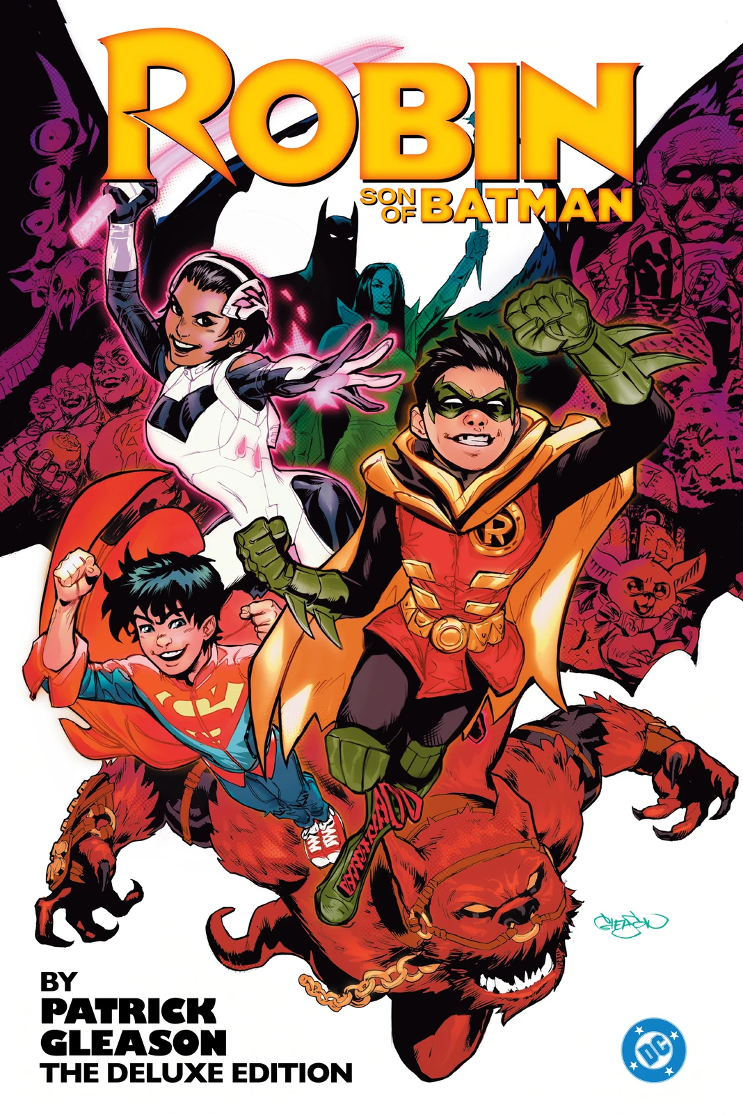
Patrick Gleason can, and a surprising amount of modern DC rests on that: two of the line's most successful runs of the last fifteen years are about children, and he drew both.
How to recognise a Gleason page
Faces that carry the scene. His acting is large without being cartoonish. Characters emote with the whole face and the shoulders, which is why the emotional beats in the books he draws land harder than the scripts alone would earn.
Children with correct proportions and correct weight. Damian Wayne and Jon Kent are physically small in his pages, and they move like kids: unbalanced, fast, occupying the wrong amount of space. It is the technical skill that made those runs work.
Anatomy that goes strange on purpose. On Green Lantern Corps he designs aliens as genuinely non-human, with joints and masses that do not resolve into a person in a suit. Then he switches back to naturalism when the story needs it.
Panels that breathe. He gives quiet moments full width and saves the density for the fights, which is the opposite of the house style around him.
The two runs that matter
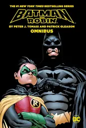
Batman & Robin By Tomasi and Gleason Omnibus at 1,248 pages is the collaboration that defines both careers. The writing is covered in the Peter J. Tomasi guide; what Gleason brings is the reason a story about a difficult child and a grieving father does not become mawkish. He draws Damian as unlikeable when the script needs it, which is harder than drawing him as adorable.
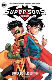
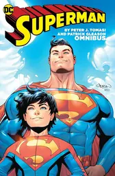
Superman by Peter J. Tomasi and Patrick Gleason Omnibus at 1,128 pages is the warm inverse, and the run where he shares the writing credit as well. Super Sons Omnibus at 600 pages puts the two children together and is the purest showcase of what he does that others do not.
The cosmic shelf
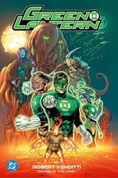
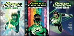
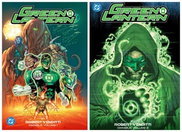
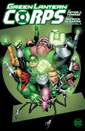
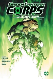
Green Lantern Corps by Peter J. Tomasi and Patrick Gleason Omnibus Vol. 1 at 1,272 pages and a second volume at 1,384 pages are where the alien design work lives, and they run alongside the material in the Geoff Johns guide.
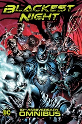
He also drew significant stretches of the main Green Lantern run and Hawkman by Geoff Johns Omnibus at 704 pages, plus the enormous Blackest Night Omnibus. On the shared-credit event books he is one artist among several, so buy those for the era rather than for him.
The Marvel outlier
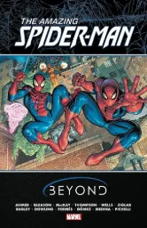
Amazing Spider-Man: Beyond Omnibus at 672 pages is the odd entry: a rotating-creator Spider-Man project where his pages sit next to several other artists. Worth knowing it exists, not the place to meet him.
What can be bought at any given moment changes; the Patrick Gleason page shows the shelf with those titles first. The wider DC catalogue lives on the DC omnibus page.
Where to start
One recommendation: Batman & Robin By Tomasi and Gleason Omnibus. It is the best-drawn thing on the shelf, it is self-contained, and the run demands exactly the skill he has that nobody else does.
If you want the cosmic side instead, Green Lantern Corps Vol. 1 shows the alien design at full stretch, though it reads better with the Johns material around it.
Who should skip this shelf
His register is bright, expressive and fundamentally sincere. If your taste runs to grit, photo-reference and heavy shadow, his pages will read as too open and too clean, and the emotional playing will feel broad. This is not the shelf for someone who wants their superheroes drawn like a crime film.



Comments
No comments yet. Be the first to share your thoughts.