Adam Kubert learned to draw from his father, who ran the only school in America dedicated to comics, and it shows in a specific way: he can do the parts most artists avoid. Weight, impact, anatomy under stress. When a Marvel book needs a fight that looks like it costs something, this is the phone call.
How to recognise a Kubert page
Impact you can feel. His figures brace, twist and absorb. A punch lands with the body behind it and the recipient goes somewhere as a result, which sounds basic and is the thing most superhero art gets wrong.
Heavy inking with texture. Rough, energetic linework and dense blacks, closer to illustration than to the clean house style around him. His pages look like they were made with effort.
Layouts that break when the story does. He holds a conventional grid for ordinary scenes and then shatters it at the moment of violence, which is why the big beats read as ruptures rather than as splash pages.
Faces that show strain. His characters look tired, hurt and unglamorous. It is unfashionable and it is why his action carries emotional weight.
The Ultimate years
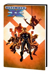
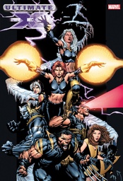
Ultimate X-Men Omnibus Vol. 1 at 1,024 pages is the most concentrated dose of him on this shelf, drawn inside the run described in the Mark Millar guide. A second volume at 1,160 pages continues it.
This is the work that reintroduced the X-Men to a generation with no continuity attached, and his drawing is a substantial reason it landed: the mutants look dangerous and the violence looks real, which is what separated the line from the main universe books at the time.
Ultimate Fantastic Four Omnibus Vol. 1 at 856 pages carries his work on the other flagship of that line.
Wolverine and the Hulk
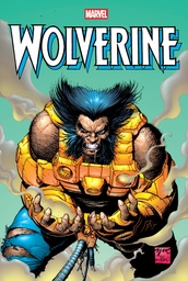
Wolverine Omnibus Vol. 6 at 1,152 pages and Wolverine Omnibus Vol. 5 collect the 1990s run where he made his name, on the character his style suits better than any other.
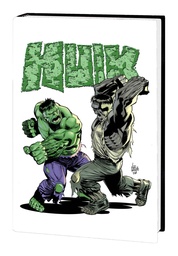
Incredible Hulk by Peter David Omnibus Vol. 5 at 904 pages is the closing stretch of the run covered in our Peter David guide, and his pages give that ending the physical weight it needed.
The modern work
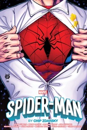
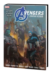
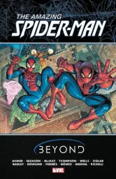
Spider-Man by Chip Zdarsky Omnibus at 936 pages is the recent collaboration, and Avengers By Jonathan Hickman Omnibus Vol. 2 at 1,088 pages carries his contribution to the architecture described in the Jonathan Hickman guide.
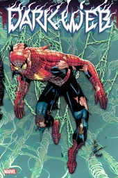
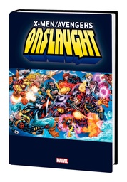
X-Men/Avengers: Onslaught Omnibus and Dark Web Omnibus are the shared-credit event books on the shelf, where he is one artist among several.
The whole shelf is on the Adam Kubert page.
Where to start
One recommendation: Ultimate X-Men Omnibus Vol. 1. His pages are a substantial share of it, it needs no continuity at all, and the material suits exactly what he does best.
If Wolverine is the draw, Wolverine Omnibus Vol. 6 is where the style is at its most characteristic, though the writing around it is more of its decade.
Who should skip this shelf
His line is rough by choice, and readers who prefer polish, clean rendering or elegant figure work will find it scratchy. The pages are also busy: heavy blacks and dense texture can make quiet scenes feel as loud as the fights.
The shelf is also spread across other people's runs. Apart from the Ultimate material there is no single volume here that is his showcase, so buying specifically for his art means checking how much of a given book he actually drew.





Comments
No comments yet. Be the first to share your thoughts.