Most artists who experiment with comic-book layout do it at the cost of readability: the page becomes a puzzle and the story stops. Bruno Redondo does the opposite. His most formally daring pages are also his easiest to follow, and that combination is rare enough to be the whole reason to know his name.
His shelf here is small and unusually consistent. There is no weak stretch on it.
How to recognise a Redondo page
Layout as storytelling, not decoration. He builds pages that do something: a single continuous shot across an entire issue, panels that share a background, sequences where the gutter itself carries meaning. The technique always serves the scene rather than announcing itself.
Clean line, real weight. His figures are drawn with a clarity that looks simple and is not. Nothing is hidden in shadow or rendering. When a character lands from a height, the drawing tells you what that cost.
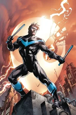
Body language over facial rendering. He characterises through posture. Dick Grayson is recognisable in silhouette because of how he stands, and that is a deliberate choice on a character defined by movement.
Colour designed into the drawing. His pages are built to be coloured brightly, which is why his work looks nothing like the muddy house style that dominated superhero comics for two decades.
The main run: Nightwing
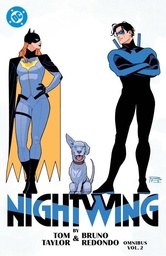
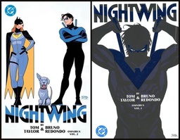
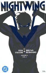
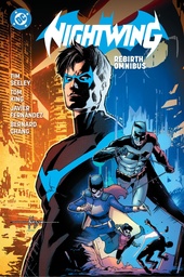
Nightwing by Tom Taylor Omnibus Vol. 1-2 at 1,248 pages collects the run as a set, and 1,248 is exactly the sum of the two individual volumes, so the set is the whole thing rather than a selection.
This is the work to own. It contains the issue drawn as one continuous unbroken shot, which is the single most talked-about piece of superhero page construction of its decade, and it is not a stunt: the technique exists because the story is about a man in constant motion through a city he loves.
The writing is covered in the Tom Taylor guide. The partnership is the reason the run works; neither half explains it alone.
The Injustice years
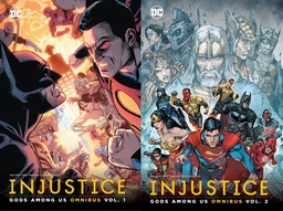
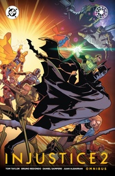
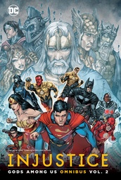
Injustice: Gods Among Us Omnibus Vol. 1-2 at 2,048 pages and Injustice 2 Omnibus at 920 pages are where he did the volume work that built the craft.
These are digital-first comics produced at a punishing schedule, and the interesting thing is that the drawing never degrades. Redondo is the visual anchor across an enormous amount of material with many other hands involved, and the consistency is what made the line readable. As a story it is a tragedy about Superman becoming a dictator; as a demonstration of professional stamina it is remarkable.
For the current state of the shelf rather than this article, look at the Bruno Redondo page. For DC beyond this shelf, see the DC omnibus page.
Where to start
One recommendation: Nightwing by Tom Taylor Omnibus Vol. 1-2, the set rather than a single volume. It requires nothing from you, it is the best-drawn mainstream superhero comic of recent years, and the continuous-shot issue alone justifies the shelf space.
If you would rather see the volume work first, Injustice: Gods Among Us Vol. 1-2 is far heavier reading than a video-game tie-in has any right to be.
Who should skip this shelf
The clarity that defines him is also what some readers do not want. There is no grit here, no scratchy line, no shadow doing the work. His pages are bright and legible, and if you associate seriousness with darkness they will read as lightweight. The shelf is also short: two projects, essentially, which is not much of a career to explore compared with the older artists on these shelves.


Comments
No comments yet. Be the first to share your thoughts.